Showing posts with label Web Design. Show all posts

14 Mar 2015

10 web design trends that will change everything in 2015


By Craig Grannell at CreativeBloq:

Some of the web's smartest thinkers reveal what they believe will transform the web.

In 2014, the biggest web design trends included: grid layouts, flat design, background videos, and the increasing capabilities of HTML5 APIs.

So which trends, technologies and techniques will define 2015? net magazine set out to uncover them by asking 20 of the web's brightest designers, developers and thinkers.

Here's our list of 2015's defining trends. Some ideas are featured in net magazine's feature. Most contained here are exclusive, and you won't read them anywhere else.


01. Huge background images

Front-end developer Benjamin Hollway expects more massive background images in 2015, "used alongside rich typography and subtle parallax effects", largely due to the lead taken by massive brands such as Apple and Google Nexus.


02. Card-based design

Creative director Haraldur Thorleifsson says card-based design will be big: "Content needs to fit on different types and sizes of screen, and cards are the easiest way to make that work across platforms." He adds this presents a design challenge, since cards can be dull, "but we're seeing fun, clever takes on this from companies like Google".


03. Digital-first branding

Clearleft founder Andy Budd (clearleft.com) says "as more companies realise their customers' primary experience with them is online, we'll see more digital-first-approaches to branding". He predicts companies "ditching traditional branding agencies who treat the web with the same care as a branded mug", instead "commissioning digital agencies to conceive a brand that works first online before filtering down to other channels."

Ghostly Ferns founder Meg Lewis (darngood.co) adds this may result in "more brands with responsive, fluctuating logos," which will "force designers to think about a logo from 'big picture' to 'minute detail' as it scales".


04. Open data

Sally Jenkinson says open data's been on the rise, but many digital spaces remain "more closed than ever" and so "leaders such as The Open Data Institute are working to promote more openness". She reckons this will gain public awareness in 2015, and projects will respond accordingly, in terms of publishing and consumption.

Clearleft's Andy Parker says we'll therefore see "more public and private companies making data and content available". In turn, this will result in "some pretty spectacular services being created, like the Cern sandbox".


05. Responsive design – evolved

Designer Victor Erixon (minimalt.se) expects the industry to "continue maintaining simple and minimal aesthetics," with the web "becoming fully customised for different viewports".

But others see responsive design going further. Jonathan Smiley (jsmiley.me) thinks we'll see "responsive design practices become more important in native apps," in part through a proliferation of wearables. "Apple Watch, for example, relies on a responsive-like flow to accommodate a small screen, and so while 2015 isn't the year the web and native become the same, it'll get us much closer."


06. Privacy

Designer Laura Kalbag (laurakalbag.com) says we've long "designed for security, so people can trust forms and checkouts with their information". Now, as people become aware of how data can be exchanged with third parties, "they'll be reluctant to share it without good reason — and rightly so".


07. Isomorphic JavaScript

Web design author and practitioner Aaron Gustafson has an alternate take on investment in frontend JavaScript frameworks like Angular and Ember: "Development benefits can be great in terms of speed of development, but there are costs to using this approach. JavaScript is the single biggest point of failure in any web-based product. Unlike on the server side, we do not control the execution of code in the browser."

He therefore reckons we'll see more use of isomorphic JavaScript, for companies that have heavily invested in JavaScript for their site infrastructure: "It offers improvements in the areas of performance, SEO, and maintainability to boot. Airbnb and Twitter have moved to this approach. Others will surely follow."


08. Iteration

Designer Robby Leonardi mulls that perhaps 2015's big trend will be iteration on what we already have: "We just had trends such as responsive and flat design, and it will take time for another big thing to happen."

By contrast, he sees enhancements on existing concepts and technologies, with increasingly sophisticated web layouts, better typography, and more designing in the browser.


09. Vibrant design


BaseKit co-founder Richard Healy believes Google's Material design specification – intended to combine the texture and tactility of paper and ink with the 'imagination and magic of digital' – will inspire designers.

He told us: "Think bold, graphical and intentional. We're talking vibrant, unexpected colours, contrasted with subdued and muted environments; large-scale typography, soft directional lighting and shadow; the use of responsive design best practices; and meaningful motion – carefully choreographed animation that provides fluid, seamless touch transitions and, more importantly, delights users."


10. Web components meet adaptive design

Developer Aaron T Grogg predicts "web components and adaptive development will combine to create a new style of web development". Someone will then fashion a "snappy acronym for this approach, which will cause all job ads to now require it".

By adaptive, Aaron clarifies he means making decisions on the server regarding mark-up to send a user, usually depending on the device being used. "When you combine the power of adaptive development with the flexibility of web components, I think we are going to see very creative solutions from designers and developers.

Hopefully, we will still be creating mobile-first, responsive, one-site-for-all-devices, but making subtle differences will be powerful tools in our toolboxes."

13 Apr 2014

8 Things to Consider When Choosing a WordPress Theme


By Amy Edwards at Social Media Today: 


So, you’ve been tasked with setting up your first WordPress blog. You’ve chosen a blog name and chosen your voice and topic (and all the other things I mentioned in my “setting up your first blog” post in February) – so now it’s time to choose a theme for your blog.

For those of you that aren’t aware; a theme is basically just a design skin for your blog. It’s a pre-designed template which you just basically download to your WordPress dashboard to change the look and feel of your blog.

Now, when it comes to choosing a template it can be hard to know where to start. There are thousands, if not hundreds of thousands, out there which all have different features, different typography and different imagery settings – which means you’re pretty much guaranteed to be spoilt for choice.

That said, there are a few things you need to consider which should help you to narrow down your theme options.


1. Is It Responsive?

When choosing a theme it’s important to check it’s got a responsive design which will automatically optimise and adjust the format of your blog for mobile devices. Fail to choose a theme which has a responsive design and you risk being stuck with a blog which runs off the frame when accessed from a smartphone or tablet – not a good look if you want people to take your blog seriously!


2. How Many Times Has It Been Downloaded?

If you’re struggling to choose between a couple of themes, have a look at how many times they’ve been downloaded. While a high number suggests it’s quite an effective theme, it also tells you it’s been downloaded a lot which means it’s going to appear on a lot of other sites on the internet. While that’s not necessarily an issue for many, it could be a problem if you were hoping to create a unique blog which is quite distinctive in theme and style.


3. How Easy Is It To Customize? 

Following on from that last point, if you’re looking at creating a fairly unique looking blog, you need to consider how easy the blog is to customise. With some themes, it’s easy to customise the theme straight from the ‘Theme Options’ tab, however with some it’s more complicated and involves editing the CSS theme files directly – something which can be pretty tricky if you’ve got no experience of CSS – so choose carefully!


4. How Easy Is It To Read? 

Now, this one might sound silly but it’s a valid point. While some blog themes can be really cool and exciting with lots of imagery, in reality, the design actually makes them really difficult to read – and means they’re much more suited to a graphic design or photography blog. When looking at a theme, be sure to check out both the home page template and an individual post template to see how much content you can actually fit in and how easy it is to read and digest.


5. How Functional Is It?

Just like design, functionality is a key thing to consider when choosing a blog theme. Consider how easy it is to navigate, how easy it is to actually find a piece of content you’re looking for and then comment on it – and how easy it is to integrate widgets. If there’s no sidebar built into the theme you could struggle to find a place to fit in additional widgets which can help to improve the user experience of your blog.


6. Does It Have Advertising Slots Built In?

If you’re hoping to monetise your blog in the future, it’s important to check that there’s advertising slots built into the template from the beginning and the theme is compatible with some of the more popular advertising plugins. Fail to do this and you could end up with a big headache later when someone’s willing to pay to advertise on your site but the functionality just isn’t there with your current theme.


7. Is There A Price Attached?

When you’re looking at WordPress themes, you’ll realise pretty quickly that some come with a fee attached and some are free. Now, while there are lots of excellent free ones available, it is sometimes worth considering paying for a theme. Normally with paid themes (which can cost anything from $20-$100) you’ll get more customisation options (normally you can make changes to the design of the template straight from the ‘Theme Options’ tab, rather than editing the CSS), more support and more functionality – which can help to make your blog look more professional. With that in mind, depending on your budget, needs and aims, I’d say it’s definitely worth considering shelling out for a paid theme…


8. How Many Queries Have Been Resolved In The Last Six Months?

Just like plugins, with WordPress themes, you can ask for support from the developer or from other members of the WordPress community. That said; when choosing a theme, I’d definitely urge you to look at what support is available with the theme, how many queries there have been with the theme and how many of these have been resolved in the past six-12 months. Alarm bells should ring if there are lots of queries (because it suggests there are problems with the theme which aren’t easy to fix), however if a lot of these have been resolved it suggests the developer is extremely active in the WordPress community and willing to help users – so it might be a theme that’s still worth considering.


Think I’ve missed anything out? Or have anything to add? Tweet me – @amy_edwards88.


22 Mar 2014

Online Web Design Platforms: Webydo vs. Adobe Muse


Via Graphic Design Junction: 


When comparing web design platforms, the first question that generally comes to mind is: “How much code will I have to write?”

The new generation of website builders for professional designers have taken the approach that you shouldn’t have to know how to code in order to build complex and fully- featured websites.

This new-attitude has liberated professional designers from having to learn the dark art of coding websites or partnering up with someone with the requisite skills.

Two platforms that promise to deliver code-free website design, and go about it in different ways are Adobe Muse and Webydo.


While Adobe tools have been the staple of designers almost since the advent of the personal computer the company has never had a web design tool that allowed designers to create websites in the same way that Photoshop, InDesign and Illustrator have enabled them to tackle other elements of design.

Muse changed all that for Adobe users. It marks the first step towards an Adobe website design tool that frees designers to be designers.

Webydo achieves the same thing, except it does it for less money and in a completely cloud-based environment. Offering a free plan that still leaves all the features available to users and a premium plan that offers unlimited page creation, web hosting and 2GB of storage. Muse on the other hand is a desktop application and limits some creative and publishing abilities.

Muse is very much an Adobe product. You get it as part of your Creative Cloud subscription or as an individual product. Either way you are paying an annual fee to have access to the platform. A Creative Cloud subscription can set you back anywhere from $15 a month for just Muse or $50 a month for the full Creative Cloud license (there are some discounts available for existing Adobe users).

Webydo has two pricing tiers, Free and Premium. Free gives you access to all the functionality of the service with the exception of custom domain names. This is a stroke of genius on their part as it allows users to experiment freely with the platform, but as soon as they are going to be making money out of it they will need to add custom domains. The premium plan costs just under $8 a month if you pay for the year or just under $10 a month if you pay every six months.


An issue related to cost and another where Webydo comes out on top as the winner of hosting. Because Webydo is a hosted solution it includes the cost of hosting the site, something that will cost you extra if you choose to go with Muse. Webydo leverages the Akamai content delivery network which means that users are going to get a better experience than if your site was hosted in a specific, geographic, location. They also handle messy things like security and backups for you so all you have to worry about is the actual design of the site, and keeping your customers happy.

If you decide to get your hands dirty and play with the code it is simpler in Muse but in Webydo you can view the underlying code but it isn’t something that you really want to be doing, mostly because it defeats the purpose of using a service like Webydo.


The first thing that you need to do when building is a site is create your plan. Both Muse and Webydo have systems for this. Muse’s looks more like an organogram while Webydo’s reminds me more of a folder structure with pages linked to other pages in a nested format. Both work equally well and allow you to rearrange the plan should it be necessary at a later date.


A big difference you are going to notice between the two platforms will come once you start building the site. Where Muse has been stuffed to the gills with features and like so many Adobe products you need to understand where features are located before using them. A novice would be completely overwhelmed.

With Webydo everything is front and center, but you do need to have a grasp of the basics of design. Things like what a text box does and what a shape or image box does, but these are concepts that a designer would be completely comfortable with. Webydo, however, is not aimed at the causal web user and neither is Muse. Both target the professional designer and more specifically those looking to create a website but who are not interested in medaling with writing the code manually.


Where Webydo comes to be the victor is in the additional services that it has built around the design platform. Some of these services are focused on improving the business of design while others are there to empower the users and take some of the load off the designer.

Firstly apart from being able to white-label the Webydo experience by replacing the Webydo branding with your own, the service has some neat features built in including “Bill my Client” which generates a payment request straight out of the Webydo backend and they even handles the payment processing on your behalf.

At the same time Webydo comes with a full content management system baked into the service. You can add CMS users and even tag elements that CMS users are not allowed to edit. That way a designated content manager can update key information on the site without the need for you to get involved. On the other hand Adobe Muse does not yet offer the same service.

The ability for users to participate in the development of Webydo is also a plus as you can see what suggestions have been made, make comments on those suggestions, vote for features you want to see as well as see the comments from the development team.


Both platforms allow the designer the freedom of control and better client management, but Webydo over Adobe Muse comes out the victor for high end production. Between the multiple professional features like bill your client, build your brand and their robust CMS it is clear why already more 57K professional’s designers are creating their sites on and managing upwards of 113K websites worldwide from a single Webydo platform.


Given a choice between the two, the Creative Suite subscribers might choose to go with Muse as it is part of the package, while the design professionals will choose Webydo, with its hosting, more intuitive interface and whole host of advanced website design features.


Via Graphic Design Junction.

21 Mar 2014

600+ Design Freebies to Download Today


By Tom May at CreativeBloq: 

We're huge fans of Dribbble and Behance at Creative Bloq. But while both services are primarily aimed at helping creatives showcase their work, we've noticed they're also becoming home to some very handy free resources.

Every day, new freebies for designers are getting added to Dribbble and Behance, and you can find free icons, templates, UI kits and mock-ups if you look hard enough. But maybe you don't have time? In which case, you'll be pleased to hear a new site has sprung up to help you out.

DBFreebies is a nicely presented service that gathers together the best freebies added to both sites and makes them easy to find. All freebies are manually selected by the site's creator, Stéphane Winter, and they're sorted into a variety of categories - such as 'Fonts', 'Icons' and 'Templates'.

Web developer Winter built the site, which launched just two weeks ago, using AngularJS and the Dribbble and Behance APIs. If you release a freebie yourself on Dribbble or Behance and you want it featured on DB Freebies, then you'll need to add the tag 'free' or 'freebie' to it.


Read the full story >>


Flazio Lets You Build A Site Through Your Facebook Page


By John Biggs at TechCrunch: 

Website creation software is a dime-a-dozen. You press a button, type in some jazz, and come up with a one page website for you and yours. But what if I said there was something that could make it even easier? Flazio, a service made by Sicilian brother and sister team Elisa and Flavio Fazio, can presumably do just that.

Now while I think it’s kind of mean that Flavio named the app more after himself than his sister, I guess that’s just how things work in that family and I guess Elaflazio would have sounded funny. So what does it do?

First, it’s a one-step website maker. Reactive design, HTML5, templates, yadda yadda. Unfortunately a lot of it isn’t translated it. But the cooler part is the Facebook app which allows you to export your feed or your private Facebook pages right onto the web.

The app is here and you essentially connect your Facebook account to the system and it drags your data and posts right off of your page. It’s a cute trick that can turn Internet lookie-loos into fully-fledged website impresarios.

The pair raised $400,000 in private equity from Zernike Meta Venture and they’re looking to expand globally. They’re seeing 4,500 users daily and over 90,000 websites have been built.


Read the full story >>


20 Mar 2014

10 Must Have WordPress Plugins for 2014


By Jonathan Long at HuffPost Small Business Blog:

With so many websites utilizing the WordPress content management system these days it has resulted in a large number of plugins available to webmasters. They help webmasters do everything from analyzing data on the site to helping improve the SEO. The WordPress plugin directory allows webmasters to search the available plugins, and with nearly 30,000 available plugins there is one for virtually any need.

Using plugins can help improve the performance of a website, the search engine optimization, and the overall user experience. Here are ten must have plugins for 2014, in no particular order.


1- WordPress SEO by Yoast


WordPress is a great CMS (content management system) in terms of a great foundation for SEO, and adding this plugin helps the average webmaster learn what factors are important and impact search results. Using this isn't going to necessarily translate into top rankings, but it helps hold the website owners hand through simple optimization steps.


Akismet is a must have plugin that prevents your blog from being filled with spam comments. It lets the website owner review all of the spam comments within the comments admin section of the WordPress dashboard. You don't like spam and your website visitors don't like spam so make sure you have this great plugin installed.


This plugin allows webmasters to manage multiple contact forms on their website and has security features such as CAPTCHA and Akismet spam filtering. With over 16 million downloads this is the most popular option for those who want a simple to use contact form option.


This plugin generates an XML sitemap for the website and helps the pages and posts get indexed by the major search engines. Every time a new post is made the plugin notifies the search engines. This is the easiest way to provide web spiders with an easy structure to crawl.


The Digg Digg plugin provides an all-in-one social sharing tool that displays on the pages and posts that the website owner desires. Social sharing is such an important component of content marketing and as we move forward social signals are beginning to be looked at as an important part of a search engine optimization campaign. This plugin provides a nice looking social toolbar and gives website visitors an easy way to share the content across their social media profiles.


6- 404 to Start


This is a plugin that quickly eliminates any 404 errors by redirecting any error page to the homepage or another URL that the website owner specifies. So, if someone types in a URL incorrectly instead of seeing a big 404 error message they will simply be redirected to another functioning page. Also, if someone attempts to visit a site through a broken link they will land on the homepage (or any other specified page) instead of seeing an error message.


7- Subscribe2


Subscribe2 is a plugin that provides the website owner with an easy to use subscription management system as well as an email notification system. Website visitors can easily submit their email addresses to be alerted when new content is published on the site. This is great for website visitors that want to be instantly notified when there is new material to read and it is great for the website owner as it helps to bring visitors back on auto-pilot.


This plugin provides a simple solution to those that want to quickly connect their Google Analytics to a WordPress based website. This plugin was developed by the same team that brought us the WordPress SEO by Yoast plugin.


This is a great plugin designed to keep your website visitors engaged with the content on your website. It allows the website owner to place a specified number of "related posts" at the end of each post. Once a visitor finishes the particular post they are reading they will see several suggested posts that are similar to the content they just read. The goal is to get them to click through to another piece of content. This is a great tool to keep the visitor on the website for a longer period of time.


This is a great plugin that impacts the performance of the website by improving the speed. By increasing the server performance it results in a much better experience for the website visitor. Having a slow website that takes forever to load will result in visitors leaving quickly and likely not returning.


These are ten great plugins that are absolutely free to download and use on your WordPress website. You can also search the plugin directory to find thousands of other great plugins to help you improve your website and provide your visitors with a more enjoyable experience.


Follow Jonathan Long on Twitter: www.twitter.com/MDMSEO

http://www.huffingtonpost.com/jonathan-long/10-must-have-wordpress-pl_b_4988228.html


17 Mar 2014

#FREEBIE: Brochure Template PSD 1


Via Free PSD Files:

Brochure template psd designed in the trendy flat style. We’ve used a colorful superhero character that really adds friendly and welcoming atmosphere. Grab our freebie and either store it in your personal collection or use it for your next projects.

Brochure template psd featuring tons of eye-catchy graphics and details. We did our best to design a tri-fold brochure that will grab the attention of your audience. Of course, we took care for everything else - it’s a 300 dpi brochure, made in CMYK color mode. So, all you have to do is just to add your own images and text and you are ready to print the brochure.

Adding a colorful character to our brochure was definitely a smart move. We placed a superhero character from VectorCharacters which made the look and feel of the brochure a bit nicer. Even more, it added some real personality to this template! So, we advise you to keep the character as it is. Of course, if you are not a huge fan of cartoon characters, you can always replace the image with your own.

You can use our brochure template practically in any case. Our brochure template comes with paragraph styles for:

- About section;
- Contact us;
- Services;


We stand by those of you who want to develop further our brochure template. Don’t limit your creative ideas and improve our brochure template. You can even combine this brochure with our tri fold brochure template and mix and match the layout and colors.


Template by Free PSD Files.

4 SEO Benefits of Responsive Web Design


By Hayley Francis at Search Engine Journal:

With more people using their smartphones and tablets to browse the internet, it has become increasingly important to create a website that works across multiple platforms. After exploding onto the scene in a blaze of glory in early 2012, responsive web design (or RWD) is now firmly established as the best way to create a website mobile visitors love, and has become a central feature of the modern web design landscape. 2013 may have been hailed as “The Year of Responsive Design”, but RWD is far from last year’s news.

In simple terms, responsive design means a website’s pages reformat themselves depending on which device they are being displayed on, ensuring that whether the content is viewed on a phone, tablet, or desktop computer, the website will remain user-friendly. Why has this made such waves in the web industry? This is remarkably different from previous mobile solutions of creating a separate mobile site or a dynamically served mobile site.

But when it comes to SEO, can a responsive layout increase the chances of a website succeeding in the SERPs? (SPOILER ALERT!) The answer is a resounding yes, and here’s why.


1- Google Loves Responsive

And since Google is the divine being you’re trying to impress with your website, it is wise to pay attention to what Google loves. Google not only recommends RWD as the best way to target mobile users , but also favors mobile-optimized sites when presenting results for searches made on a mobile device. This is especially true when mobile users search for local services.

There is still some debate surrounding the issue of whether a separate mobile website or a single, responsive site is the best route to take, but from an SEO perspective, the latter is generally the better option. Separate mobile websites have their own URL and different HTML to their desktop counterparts, whereas responsive sites use one URL and one set of pages and files, making it simpler for Google to crawl and index content.


2- One Website, One URL

Building a separate mobile website does have a few benefits of its own, and in some cases creating a standalone mobile version works well. If a website features a lot of content (a news site, for example), a responsive version of the website could soon become the “scrolling version”, with users having to give their index fingers a serious work out just to navigate through the content. This is where a mobile site, with content which has been carefully refined for mobile browsing, can come in handy.

From an SEO perspective, one of the main challenges posed by having a separate mobile site is that you will need to build the authority of this site from scratch, and most separate mobile sites do not rank well in search engines, as they are canonicalized to their desktop counterparts. On the other hand, redesigning your website as responsive will enable you to maintain your backlinks, and will mean that you can focus your SEO on one single site. This means all of your links will be directed to one domain (as opposed to one mobile website and one desktop site), giving your responsive website a boost in the SERPs.

Furthermore, if you have a responsive website, you can build social shares for just one URL, and when the site does get shared, wherever the link is viewed – whether on a mobile, tablet, or on desktop – all of the content will be clear and easy to navigate.


3- Responsive Helps Combat a High Bounce Rate

Even if a website is sitting pretty in search results, if it doesn’t work effectively for mobile and tablet users, bounce rate will be a big problem. Mobile websites can suffer from a high bounce rate if the content they offer is too stripped down, or too dissimilar from the content offered on the desktop site. Google will interpret this high bounce rate as a sign that a website isn’t offering relevant content to users, which is likely to lead to a drop in rankings.

A responsively designed site combats this problem by presenting all of the same content found on the desktop site, but in a functional way. RWD means that there is no need to compromise on the content you choose to display, this ensures visitors always receive the information they are looking for – which keeps them on page!


4- User Experience is Enhanced

Websites are essentially a tool for sharing content.  A user-friendly site makes it easier for visitors to find, absorb, and pass on this content. Above all else, responsive design places an emphasis on designing for the user – and with user experience being a big ranking factor, it makes sense that Google is encouraging developers to embrace RWD.

If visitors are browsing a site via their mobile or tablet, they should be able to view all of its content as easily as desktop users. Say you spot something on a website whilst browsing on your computer, and want to send it to a friend who will view it on their phone. If the website is responsive, and has been designed well, the content will work just as well on their screen as on yours.

Responsive design helps modern websites appeal to modern users; users who are increasingly likely to traverse the internet using a mobile or tablet device, but who still expect their desktop experience to be as smooth as ever. Going responsive is the most effective way to make the most of mobile and tablet traffic, and to offer visitors the best possible user experience.


16 Mar 2014

#INFOGRAPHIC: 10 Strategies for Building a Better Business Website


By Randy Milanovic at Social Media Today: 

Why It's Time to Start Thinking Differently About Business Websites?

Is your business website working as hard as it should be? Is it helping you to reach your real-world, bottom-line business goals?

Most aren't. In a day and age when it's possible to accomplish so much via the web, most business websites still serve more as "web signs" than actual sources of new customers. They might have nice visuals, but they often aren't compelling, or effective... and most certainly aren't generating new sales opportunities.

Of course, most business owners and executives would love to have a stronger web presence, but aren't sure how to get one. Often, they fall into the trap of thinking that a different design, or perhaps the newest seo gimmick, will do the trick. That's understandable, but the reality is that it takes a lot of different pieces working together to produce a website that's actuall­­y good for your business.

In the short e-book this infographic is based upon, I share 10 of the most important strategies with you. These aren't just concepts or techniques that we’ve dreamed up over coffee, but proven tactics we've used again and again to produce extraordinary results. What kinds of results am I talking about? A 500% increase in new leads over a six-month time period hasn't been unusual, once we get all the components in place and working in harmony.

It's just as important to note that these don't just create new sales opportunities, but potentially better ones, with more lifetime value from each account.

That's because, when new buyers are voluntarily coming to you for answers and requesting information from your company rather than responding to your sales or advertising efforts, the relationship starts off on a significantly better foot. There is more trust on both sides, with fewer negotiations over price, making it easier for a healthy long-term partnership to develop.

If that's the kind of performance you want from your business website, read on. You won't find any gimmicks or cheap tricks in this infographic or the "Building a Better Business Website" book, but you will find simple, straightforward ideas that could dramatically change the way you think about your online presence and the return you get from it.


10 Crucial Strategies for Building a Better Business Website
Explore more infographics like this one on the web's largest information design community - Visually.


Via Social Media Today.


20 Feb 2014

5 Ways to Keep Visitors on Your Website Longer


By Ebony Grimsley at Social Media Today: 

You have the right domain name, great search engine terms, the perfect mobile ready and responsive design website around, great speed rates and are still wondering why your visitors are spending less than a minute on your site.

Beyond speed to load and balancing content with other visually appealing aspects to draw in visitors, here are five additional methods to use to keep visitors on your site longer.


1. Video Content.

According to WebDAM, visual data is processed 60,000 times faster by the brain than text and videos on landing pages increase conversions by 86%. These numbers cannot be ignored. Having a video is a great way to convert sales and build intrigue with your product. But many of you realize this and it’s why your Youtube page has several videos sitting idly by hoping for traffic. You have created great videos, but have yet to incorporate them to your website for either coding reasons or lack of knowledge about easy tools to make it happen.

There are several web plugins to help you tie in your videos. For those of you on WordPress platforms, you can easily download a free tool called, Smart Youtube Pro. The tool has over one million downloads and offers a more visually appealing look to your site. Simply paste your Youtube, Vimeo or other link to an existing video on the internet and you can easily add more time for people to be on your site and for you to gain their trust. (Please note: The first video your visitors come to should not be long in length. This would reverse your chance to get them to stay longer to review the rest of your site.)


2. Slide Shows.

Slide presentations are a great way to show content in a more visual and light manner. A well prepared slide show is also a great way to use information and images to draw visitors into your products or services. Also, for those who lack the video production budget, slide presentations can also help to drive home your brand while appearing savvy. Only smart people create presentations, right?

Another great tool for WordPress site users is seoslides by Alorum. Slideshare is a great website and helps with SEO, but seoslides allows you to embed your presentations anywhere. In other words, you can now place your awesome presentation from a recent conference on your own website and still draw in traffic due to the ability they provide to build your own SEO-optimized slides.


3. Link to internal content on the website.

It really is quite the basic thought but missed by many. If your website has related topics, why not link to them? With strategic linking to quality content on your page, you can keep visitors hungry for your website. They could easily end up visiting more pages and reading more information while subconsciously realizing you offer them great value.

In particularly on your blog, you will fall in love with the widget, LinkWithin. It gives you an opportunity to visually link other articles you posted on your blog underneath one post. It’s a great way to prevent older stories from losing traffic.


4. Add chat feature.

Let’s face it. Many industries require users to be able to ask questions about products. If your site doesn’t have a FAQ section or a forum, adding a chat feature allows visitors to obtain answers to questions they are in search of when visiting your site. You may wonder if answering a question is really a way to keep people on your site longer, however, just think about the length of time it takes to have a text conversation online. When done properly, your chat personnel can win over visitors by converting them to customers. Great customer service wins over potential customers more often than not.

Not only because you can have a help desk ticket feature along with the chat one with LiveZilla, but being able to do it on mobile devices is really the icing on the cake for businesses.


5. Give something away.

Some things are just that simple in marketing. People still love free stuff. If you determine the right item to offer for free which will cost your business very little, but still offers visitors value, you may just win at converting some visitors. In the B2B world, free downloads of white papers work very well. Podcasts are also great for businesses selling knowledge.

Buzzsprout is a podcast publishing software that allows you to embed your podcast on your site and has an easy to use mobile player. Of course, B2C organizations can also find a benefit in using this player as well.

So what do you think? Have you used any of these tools? Looking to try any out?


Via Social Media Today.
http://socialmediatoday.com/ebony-grimsley/2192386/5-ways-keep-visitors-your-website-longer

17 Feb 2014

#INFOGRAPHIC: Responsive Web Design Best Practices


This infographic features Responsive Web Design Best Practices for both web designers and web developers, including a brief history of responsive web design and some facts/figures on media consumption and mobile usage.

Published by Magic Logix.


Responsive Web Design Best Practices
Explore more infographics like this one on the web's largest information design community - Visually.

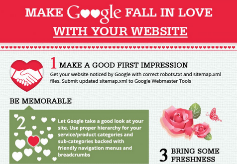
#INFOGRAPHIC: Make Google Fall In Love With Your Website


10 Steps that you need to take to get your website some Google love. From crawlability to content to quality links, this graphics gives you the key ingredients that go in making your website valuable.

Published by Dharne & Co.


Make Google Fall In Love With Your Website
Explore more infographics like this one on the web's largest information design community - Visually.

11 Jan 2014

#INFOGRAPHIC: Why Responsive Design is Important: 10 Key Statistics


Infographic outlining numerous reasons for why responsive design is a sound choice for most web design endeavors. Takes a comparative look at responsive design versus having a mobile site (adaptive design).

Via SEOcial.


Why Responsive Design is Important: 10 Key Statistics
Explore more infographics like this one on the web's largest information design community - Visually.

4 Jan 2014

The Top 10 Free UI Kits for Web Designers


Here we've rounded up 10 brilliant CSS-based UI kits that make developing a pleasant and usable website layout quick and easy. Check them out, and let us know if we've missed your favourite in the comments at the end.


Continue to the full article >>


10 Dec 2013

The Top 25 Responsive Design Tools


As responsive web design evolves, Brad Frost looks at some of the best tools, resources and thinking for crafting exceptional responsive experiences

Over the past few years we've seen an explosion of web-enabled devices with varying resolutions, capabilities, form factors, pixel densities, interaction methods and more. This onslaught of connected devices is just the beginning, and we're bound to see people accessing the web from a greater number of devices in the coming years.


Read the full story >>


5 Ways To Improve Your Website’s Conversion Rate


By Jacob Gube at TNW: 

Creating sites destined for success is tough. It requires a lot of planning, testing, and data analysis. So I asked a person who’s a veteran in the subject — Paras Chopra, the founder of Visual Website Optimizer — for his tips on how to improve a website’s conversion rate.

Paras is a pioneer and leader in usability, design testing, and conversion rate analysis. His company’s product, Visual Website Optimizer that he founded in 2009, has helped popular startups and big corporations like Groupon, Microsoft, GE, Mitsubishi Motors, Airbnb, and countless other companies increase their site’s conversion rates.

He and his team also regularly publishes their findings and case studies on improving conversion rates, which have helped many Web professionals discover better ways of building websites.

I emailed Paras and asked him one question: Based on your experience, what are the top 5 things a designer can change with his/her design that will significantly increase conversion rates and/or usability?

Here is his response to my question:


1. Remove multiple calls to action

What frustrates most users is seeing multiple options on a landing page and not being able to decide which one he/she should be using. This is also called the paradox of choice.


If you have all “Sign up for a free trial”, “Watch a video”, and “Learn more” buttons/links side by side, a visitor is bound to get perplexed about which one to choose.

We assume people know exactly what they want. But, instead, I’ve found that people want to be gently guided towards a possible solution instead of solving a maze to eventually get to what would benefit them the most.


2. Show more product/service images

How many times have you picked up a product at a retail store and examined it? It’s likely you do it for all new products you are interested in.

Unlike at physical store, on a website, customers can’t, of course, pick up a product. But you can give them the next best thing: images and screenshots.

Mere text won’t do. People want to be wowed, surprised and emotionally attach themselves to a product/service before deciding to purchase it.


People do read text, no doubt. But text alone does not convince a customer to make a purchase. Providing screenshots or images goes a long way in establishing a comfort level with your product.


3. Provide lots of whitespace, remove clutter

We always try to cram a lot of information on a page. As designers, we’re in love with our product and we want to talk about it as much as we can.

But visitors think in a different way. They need space to pause, think, and analyze. Whitespace helps them do just that. It provides a natural structure to the page, so that the eye can jump to the information it is seeking in an effortless fashion.


4. Fix navigation

It’s surprising how many designers do not design navigation at all, or design it just as an afterthought.

A visitor needs to always know where he/she is right now on the website and where he/she could go.

Navigation should be designed right after considering business objectives; for example, products that are sold together could be grouped in a category.

Design menus, recommendations, footers and other elements of the website with navigation in mind.


5. Do not miss out on social proof

Social proof is a sure-shot way to increase conversions. Many designers provide too little social proof or introduce it too late on a landing page/website.


As a prospective customer, I need to know whether a particular product is tested and proven. Adding testimonials, case studies, success stories, logos of companies you have worked with, etc. right after an introduction convinces a visitor to want to know more — this is the right time to give more details.

Learn more about Paras Chopra by visiting his personal site.


21 Nov 2013

3 Steps to Finding Your Perfect Design Partner


By Jeffrey Bowman at CreativeBloq: 

It's not uncommon for today's designers to work solo, especially freelancers. But placing the creative process on the shoulders of just one person can be a lot to carry and any number of issues can arise for a lone designer to deal with.

It could be a limited skillset holding you back. It could be an 'off day' stopping the ideas from flowing. Or it might be something as simple as missing a proofing error because your eye isn't completely on the ball.  Consequently more and more we're seeing collaborations between different designers. Some even work so well together that they establish themselves on a more permanent basis.

I've had the pleasure of collaborating and working alongside a handful of exceptionally talented individuals over the years. Some were just one-offs but others have developed into regular gigs. Establishing a good working partnership can change the way you see your work and can take your practice to a new level.

But how do you go about picking your perfect design partner? Here are three things to look for based on some leading designers' experiences...


01. Personal chemistry

There are a four important things illustrator Andy J Miller looks for in a design partner, he tells me. "The other designer needs to be complementary to your design approach and style. You need to have personal chemistry together. They need to have integrity. And the partnership should generate excitement in both of you."

In other words, it's less about the bare facts on someone's resume, and more about how you interact personally. If there's no personal chemistry, the collaboration is unlikely to work.


02. Complementary skill set

One thing that's very useful in a design partner is someone who can add to your skill set and broaden your work remit. As Ben the Illustrator explains: "For me, a design partnership is about being able to achieve new things, to create things I couldn't make alone."

Ben often collaborates with his wife Fi for this reason. "I can do illustration work myself so when I work with Fi it's on a product, which is more Fi's direction," he explains. "It's just as beneficial to share ideas as it is to share skills."
Andy J Miller agrees. "Working with a partner means getting to go places I couldn't with my own work," he explains. "When I partner with people with complementary skills, my work always ends up in places it could have never been."


03. Being able to let go

Sharing ideas is a very important part of working with a partner, and so you need to find someone who not just complements your skillset but is willing to relinquish control over a project.

Danish design partnership Hvass&Hannibal are a great example of this principle in practice. "We work well together because we're good at letting go of our individual ownership of ideas," Sofie Hannibal explains. "It's not important if it was me or Nan Na [Hvass] who came up with that particular idea - it's important how we develop it and execute it together."


Well rounded

Sometimes you both might have the same skill set but be stronger in one area than the other, and this is when working together can create a well rounded team, adds Hannibal.

"On the personal level, Nan Na is a bit of perfectionist, in a good way, so I'm always confident that all the details are just right. Whereas my interest is more the overall idea and how the concept is working. But we have a very democratic approach and it's not like we always have the same role in different projects."


Conclusion

Not all partnerships work but I encourage everyone to collaborate with someone at some point in your career. Remember that the perfect partner isn’t necessarily someone who works exactly like you, but someone who can counterbalance what you do.

Approaching a design partnership with an open mind is key, as you'll be letting go of ownership of ideas and direction. Talking to Andy, Ben and Sofie, they all stress how much fun it is to work with someone else and that it enables them to see their work in new and different ways.

Design partnerships can take on many different forms, but trying to seek out some of the common qualities discussed in this article in a design partner will be sure to set you on the path to a successful collaboration.


Jeffrey Bowman is a freelance graphic designer and illustrator whose clients include MySpace, Playstation, the BBC, Vice and Snowboarder Mag. He recently moved from the UK to the mountains of Norway in pursuit of inspiration, fresh snow and immovable peaks.


17 Nov 2013

How To Build a Multi Million Dollar Website Without Spending a Cent


By Adam Arbolino at TNW:

Do you have a business idea keeping you awake at night? Are you putting it off because you think building the website is too much work or you don’t have the knowledge to do it? With the growth of open-sourced platforms and advent of ‘freemium pricing models’, the time to try is now.

The site I co-founded, DesignCrowd.com, grew from a garage office to a thriving marketplace with 148,000 designers, and businesses who have created $12 million worth of jobs, in just a few years by applying these ideas. Here are some pointers for entrepreneurs looking to start testing your concept or minimum viable product (MVP).


Step 1: Two is better than one

Entrepreneurship can be a lonely game. Web businesses with at least two co-founders, ideally a technical founder and a non-technical founder are more likely to get investment than solo-preneurs. You also have a partner to bounce ideas off and make fast, rapid decisions.

Start networking and find a co-founder who shares your vision, and brings skills that are different from your own. Two minds are better than one!


Step 2: Code, baby, code

Assuming you have an idea already, you’re now ready to start building your website. Now all you have to do is choose a programming language and build a MVP.

A good entrepreneur recognises that speed is key. With this in mind, choose a programming language that makes it easy to start publishing code. It’s also important that you try stick to programming language that run on UNIX. It’ll be the cheapest option to get a website off the ground. My personal favorites would be Java (Grails), Ruby (on rails) and PHP.


Step 3: Infrastructure and technology stack

A few years ago, this is where you would sink all your hard earned bootstrap cash – but these days our friends at Amazon have given you a bunch of free hosting and space to get your next venture launched at no cost.

Using Amazon AWS free tier you can get started on their platform without spending a cent. Plus, by the time you’re ready to expand into a paid service, your business should have some revenue trickling in the front door to justify the upgrade.


Step 4: Validate ideas – improve conversion

In my experience, there are three golden rules to building a booming business:

- The ability to execute or code your product
- The ability to scale it (infrastructure)
- The ability to drive user demand for your product through data analytics and testing to improve its conversion rate

So far we have ticked off the first two, but now we need to work out how to get smiles on our customers’ faces. The best way to do this is to turn your product into a honeypot for buyers.

One common myth amongst new entrepreneurs is a belief that most data-driven companies need to spend a small fortune on analytics software and build huge marketing teams. I strongly disagree; the only two weapons you need in your arsenal is a quality analytics package and a validation suite. Luckily, two of the best are free (to get started):

Google Analytics: No matter the size of your business, Google Analytics will help you sleep at night. It gives you all the tools you need to track user movement. It tells you what they’re doing, what products they like and helps uncover technical issues with your site.

Visual Website Optimiser: Now that you’re tracking your site end-to-end, you also need to track your conversion from ‘start to sale’ (what’s known as the conversion funnel). VWO gives you tools to A/B test your ideas and changes and lets you see what tweaks can capture sales/demand/revenue more successfully.


Step 5: Marketing and sales

You don’t need to be a marketing MBA to learn how to generate sales leads. Many social channels are free to use and help to drive traffic and sales.

Email is a direct digital channel with strong ROI, I strongly recommend MailChimp to start with. It lets you send 12,000 free emails a month to start marketing your business to registered users on your site.

Developing a solid SEO strategy will also help you grow your business’s digital footprint. You can create awesome content to pull users in, by blogging regularly on an SEO-optimised community blogging platform like WordPress.com.

Once you get the traffic visiting your site, you need to convert traffic by strong calls to action on your product pages, capturing quality database leads along the way. To optimise your site, WebSEO and Google Places are great.

You should now have some customers coming through the door, so you need to use a CRM system to manage them. Zoho gives you the power of tracking your customers and is perfect for any sales activity you need to get off the ground.


Step 6: Communication and management tools

By this stage, you probably have grown a bit and need to start tracking tasks/employees/where you parked your Lamborghini. Here are the perfect set of tools to keep tabs on everything in your business.

- Team Task Tracking: Trello
- Team Performance Tracking: I Done This
- File Sharing Online: Google Drive or Dropbox
- Messaging/Phone System: Skype

I’m no marketing expert, but in an online world that is driven by consumer demand and social content, you don’t need to be. Our company is living proof that you can build a strong online presence using the tips above, so start!


Via TNW.
